
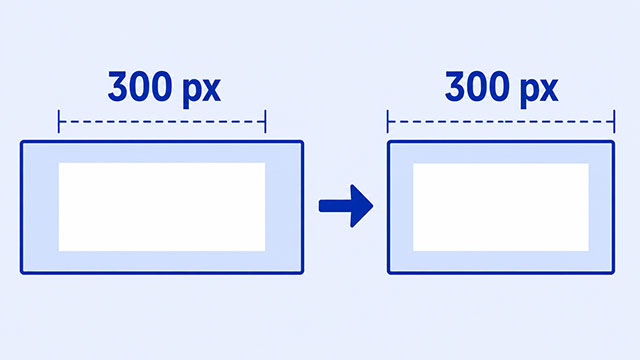
If a CSS box looks wider than the width you set, padding and borders may be adding extra space outside that width. By the end of this article, you’ll know where the extra space comes from and how one CSS rule can make the box fit the size you expected.
You might give a card a width of 300px, add some space around its text, and then wonder why the card is wider than 300 pixels. Your width is not being ignored. The browser is measuring one part of the card and then adding other parts around it.
The direct fix is often box-sizing: border-box;. It tells the browser that the width you set should cover the whole visible box, including its inner space and border.
What Your Width Is Actually Measuring
Picture a cardboard box with an object inside it. The object takes up space, soft packing surrounds it, and cardboard forms the outside edge. A CSS box works in a similar way.
- Content is the text, image, or other material inside the element.
- Padding is the inner space around that content.
- Border is the visible edge around the content and padding.
- Margin is the outside space between this box and nearby boxes.
The CSS box model is the name for how these parts work together. The important detail here is that a browser normally applies width to the content area only.
This normal behavior is called content-box. You usually do not write it because it is the default:
.card {
    box-sizing: content-box;
    width: 300px;
    padding: 20px;
    border: 2px solid #333;
}
The content is 300 pixels wide. The browser then adds 20 pixels of padding and a 2-pixel border on both the left and right.
That makes the visible width 344 pixels: 300 for the content, 40 for the two sides of padding, and 4 for the two sides of border. The declaration still says width: 300px, but the finished box is wider.
If you need a quick review of fixed and percentage widths, the lesson on how CSS width works shows how those values affect a box.
How Border-Box Makes the Width Predictable
When you want the visible card to stay exactly 300 pixels wide, change what the width measures:
.card {
    box-sizing: border-box;
    width: 300px;
    padding: 20px;
    border: 2px solid #333;
}
With border-box, the browser keeps the complete visible box at 300 pixels. The padding and border now use room inside that width, so the content area becomes narrower.
This does not remove the padding or make the border thinner. It only changes how width is counted.
It also does not include margin. A margin remains outside the border because its job is to create space between boxes. If a box still seems too far from its neighbor after you use border-box, check its margin separately.
Why Width 100% Can Still Stick Out
The same surprise is especially easy to see with width: 100%. First, create a simple frame with a card inside it:
<div class="frame">
    <div class="card">
        <h2>My Project</h2>
        <p>This card should fit inside the frame.</p>
    </div>
</div>
Now give the card the full width of its parent and add padding:
.frame {
    width: 300px;
    border: 3px solid #2364aa;
}

.card {
    width: 100%;
    padding: 20px;
    border: 2px solid #333;
}
The card’s content area already fills 100% of the frame. Its left and right padding and borders are then added outside that full width, so the card sticks past the frame’s edge.
Add one line to the card:
.card {
    box-sizing: border-box;
    width: 100%;
    padding: 20px;
    border: 2px solid #333;
}
Now the padding and border are counted inside the 100% width. The card keeps its inner space and fits inside the frame.
Check These Three Things When a Box Is Too Wide
You do not need a complicated debugging process for this problem. Start with the CSS you can already see and check it in a useful order.
- Find the width. Look for a fixed value such as
300pxor a percentage such as100%. - Check horizontal padding. Both the left and right sides can add to the visible width.
- Check the borders. Left and right border widths can add more space too.
If those values explain the extra width, add box-sizing: border-box; to the affected element and refresh the page. The box should become easier to predict.
Then check margin as a separate issue. border-box will not pull outside spacing into the set width. The lesson about how padding adds inner space and the lesson about how borders surround a box can help you identify each part.
An oversized element can also make the page scroll sideways or cause content to extend past an edge. That visible result is called overflow. Once the width calculation is clear, the CSS overflow lesson explains what happens when content or a box no longer fits its available space.
Try the Fix on a Simple Card
The easiest way to make this idea stick is to change one value and watch the card edge move.
- Copy the frame and card HTML from the earlier example into a basic page.
- Use the version with
width: 100%, padding, and a border, but leave outbox-sizing. - Notice how the card extends past the blue frame.
- Add
box-sizing: border-box;and refresh the page. - Switch between
content-boxandborder-boxto compare the two visible results.
The main idea is simple: width can measure different boundaries. With content-box, it measures the content before padding and border are added. With border-box, it measures the complete visible box through the border.
What to Learn Next
Now that the extra width has a clear cause, these lessons will help you understand and control each part of the box.
- The CSS box model connects content, padding, border, and margin in one complete picture.
- CSS size explains fixed widths, percentage widths, and how block elements use available space.
- CSS padding shows how to create useful inner space without losing track of a box’s size.
- CSS borders explains the width, style, and color of the edge around a box.
- CSS overflow helps when a box or its content extends beyond the space available.