
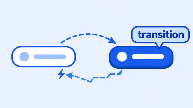
If your hover effect changes smoothly but snaps back when you move the pointer away, the transition is probably in the hover rule. Move it to the element’s normal rule so it remains available in both directions.
This is a small placement mistake, and the fix is usually one moved line. The style that changes belongs in :hover. The instruction that smooths the change belongs on the element itself.
By the end, you’ll be able to picture the element’s two visible styles, correct the snap, and check three simple details if the effect still does not look right.
The Quick Fix
Suppose a button slowly changes from blue to navy when you point at it, but returns to blue instantly when you move away. The CSS may look like this:
.button {
    background-color: blue;
    color: white;
}

.button:hover {
    background-color: navy;
    transition: background-color 400ms ease;
}
The color change works, but the transition is temporary. It applies only while the pointer is over the button.
Move the transition to the normal .button rule:
.button {
    background-color: blue;
    color: white;
    transition: background-color 400ms ease;
}

.button:hover {
    background-color: navy;
}
Now the button should ease into navy and ease back to blue. The colors did not change. Only the location of the transition changed.
Why the Effect Snaps Back
Think of the button as having two appearances. It has a normal appearance when the pointer is elsewhere and a hover appearance when the pointer is over it.
The selector .button:hover describes only the hover appearance. As soon as the pointer leaves, that rule stops applying and the button returns to the declarations in .button.
If transition exists only inside .button:hover, it disappears at the exact moment the button needs to move back. The browser still changes the color, but it has no remaining instruction to smooth that return.
Putting the transition in the normal rule makes it available before, during, and after hovering. You can think of the normal rule as the button’s home base. It should hold the behavior you want the button to keep.
Put the Change and the Transition in Different Places
A reliable beginner pattern is to separate two jobs:
- The normal rule contains the starting value and the
transition. - The hover rule contains the changed value.
Here is the pattern without any extra button styling:
.thing {
    background-color: blue;
    transition: background-color 400ms ease-in-out;
}

.thing:hover {
    background-color: navy;
}
The first rule says what the element looks like at rest and how a color change should happen. The second rule says what color to use during hover. That division of jobs is the important part.
The value ease-in-out changes how the movement feels as it begins and ends. It does not decide whether the transition is available when the pointer leaves. Changing the timing style cannot repair incorrect placement.
Check These Three Things If It Still Snaps
After moving the transition, check the code in this order. Each step answers one visible question.
- Do both rules target the same element? If the normal rule uses
.button, the hover rule should begin with.button:hover. A different class name means you may be styling something else. - Does the named property change? If the transition names
background-color, that property needs one value in the normal rule and another in the hover rule. - Can you see the duration? Write a time unit such as
400msor0.4s. For testing, a slightly longer duration makes the movement easier to notice.
Change one detail at a time and move the pointer onto and off the element after each change. This keeps the test simple and visible.
Try It With a Simple Button
This example changes the button’s color and moves it upward by a few pixels. Both changes happen on the page, so you can test the result just by moving your pointer.
<button class="practice-button">Point at me</button>The button needs a normal appearance, a transition, and a hover appearance:
.practice-button {
    background-color: royalblue;
    color: white;
    padding: 12px 20px;
    border: 0;
    transition: background-color 400ms ease,
                transform 400ms ease;
}

.practice-button:hover {
    background-color: navy;
    transform: translateY(-4px);
}
Point at the button, then move away. The color and position should change smoothly both ways.
Next, move the two-line transition declaration into .practice-button:hover. The button should still ease upward, but it will snap home when the pointer leaves. Move the declaration back to the normal rule and test again. That small experiment makes the reason easy to remember.
If the meaning of :hover is still unfamiliar, the lesson on how CSS hover works explains when that rule applies. The CSS Transition lesson then shows how property, duration, and timing work together.
What to Learn Next
Once the normal rule holds the transition, you are ready to practice smooth state changes with the supporting lessons.
- CSS Transition explains the property, duration, and timing that control a smooth change.
- CSS Hover shows how an element receives a different style while the pointer is over it.