
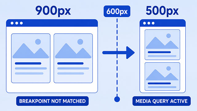
If your CSS media query is not working, the problem is usually one of four things: the breakpoint condition is not true, the mobile viewport is not what you expect, the CSS inside the media query is invalid, or another CSS rule is overriding it. The fix starts by separating two questions: is the media query active, and does the style inside it win?
That sounds like a lot, but it gives you a useful way to debug the problem. First check whether the media query is active. Then check whether the style inside it is actually winning.
A media query is just a condition. It says, “Use this CSS only when the browser matches this rule.” If the condition does not match, the browser skips the CSS inside it. If the condition does match, the browser still has to decide whether that CSS beats any competing CSS rules.
Start With One Visible Test
Before you debug your real layout, make the media query do something obvious. Change the page background, add an outline, or change a color you can see right away.
Here is a simple test:
@media (max-width: 600px) {
    body {
        background: yellow;
    }
}
Now make the browser window narrower than 600 pixels. If the background turns yellow, the query is matching. Your problem is probably inside the CSS you were trying to change.
If the background does not change, the browser is not applying that media query. That means you should check the breakpoint condition, the viewport, the stylesheet, or the syntax before worrying about the layout.
Check Whether the Breakpoint Condition Is True
A common beginner mistake is writing a breakpoint that means the opposite of what you intended.
max-width means the CSS applies when the viewport is that width or smaller.
@media (max-width: 600px) {
    .card {
        width: 100%;
    }
}
This rule applies at 600 pixels, 500 pixels, 400 pixels, and smaller widths.
min-width means the CSS applies when the viewport is that width or larger.
@media (min-width: 600px) {
    .card {
        width: 50%;
    }
}
This rule applies at 600 pixels, 700 pixels, 900 pixels, and larger widths.
The important word is viewport. A media query is not checking your phone model, your monitor size, or the size you have in your head. It is checking the browser’s current layout area.
When you study CSS breakpoints, this is the main idea to keep in mind: a breakpoint is the width where you want the design to change.
Make Sure Mobile Browsers Use the Real Viewport Width
If your media query works on desktop when you resize the browser but does not work on a phone, check the viewport meta tag.
Put this inside the head of your HTML:
<meta name="viewport" content="width=device-width, initial-scale=1">This tells mobile browsers to use the device’s actual width as the layout viewport. Without it, some mobile browsers may act as if the page is much wider, then shrink the result down to fit the screen.
That can make a mobile breakpoint look broken. The phone may be physically narrow, but the browser may be using a wider layout viewport, so your max-width: 600px query does not match the way you expected.
Check the CSS Inside the Media Query
A media query does not replace normal CSS syntax. The CSS inside it still needs selectors, braces, properties, and values.
This is not valid CSS because the declaration is floating inside the media query without a selector:
@media (max-width: 600px) {
    font-size: 16px;
}
The browser needs to know what element should get that font size.
Here is the corrected version:
@media (max-width: 600px) {
    body {
        font-size: 16px;
    }
}
Now the rule says, “When the viewport is 600 pixels wide or smaller, make the body text 16 pixels.”
Also check your braces. One missing } can make the browser read the rest of your CSS differently than you intended. If you are new, it helps to indent the code so every opening brace lines up clearly with a closing brace.
Check Source Order and Competing Rules
Sometimes the media query is active, but the style still does not show up. That usually means another CSS rule is winning.
CSS has a cascade. In simple cases, when two rules target the same element with the same strength, the rule that appears later in the CSS wins.
In this example, the media query applies on small screens, but the later rule changes the card width back to 300 pixels:
@media (max-width: 600px) {
    .card {
        width: 100%;
    }
}

.card {
    width: 300px;
}
For this simple pattern, put the regular rule first and the small-screen change after it:
.card {
    width: 300px;
}

@media (max-width: 600px) {
    .card {
        width: 100%;
    }
}
Now the media query can override the earlier width when the viewport is small enough.
Source order is not the only thing that matters. A more specific selector can also win. For example, .sidebar .card is stronger than .card because it describes a more specific target.
Browser developer tools can help here. Inspect the element and look at the Styles panel. If your media-query rule is crossed out, the browser saw it, but a stronger or later rule won.
Use Media Queries With Layout, Not Against It
A media query only decides when CSS applies. It does not automatically create a good responsive layout.
For example, you might start with a simple one-column layout. Then, when the viewport is wide enough, you can turn the section into a two-column grid.
.cards {
    display: block;
}

.card {
    margin-bottom: 20px;
}

@media (min-width: 700px) {
    .cards {
        display: grid;
        grid-template-columns: 1fr 1fr;
        gap: 20px;
    }
}
On narrow screens, the cards stack naturally. On wider screens, the media query changes the .cards container into a grid.
This is where responsive design connects to layout. The breakpoint decides when the change happens. Tools like CSS display, CSS Flex, and CSS Grid decide what the layout does at that point.
A Beginner Debugging Checklist
When a media query does not seem to work, check the problem in this order.
- Make sure the stylesheet is actually connected to the HTML page.
- Add a visible test rule inside the media query.
- Resize the browser or use developer tools to confirm the viewport width.
- Check whether you meant
max-widthormin-width. - Add the viewport meta tag if you are testing on mobile.
- Make sure the CSS inside the media query has a selector.
- Check that every opening brace has a matching closing brace.
- Look for later rules or stronger selectors that override your media-query rule.
This order matters because it separates two different questions: “Is the media query active?” and “Does the style inside the media query win?” Those are different debugging steps.
If you use an AI tutor for help, paste only the small HTML and CSS example that shows the problem. Ask it to check the breakpoint condition, the viewport tag, the selector, and the order of the rules. Then test the answer yourself in the browser.
What to Learn Next
Once your media query works, the next step is understanding how breakpoints fit into the rest of your page layout.
- CSS Breakpoints: learn how screen widths are used to change CSS at the right moment.
- Responsive Design: see how breakpoints, flexible layouts, and mobile-friendly design work together.
- CSS Display: understand how elements behave as blocks, inline items, flex containers, grid containers, or hidden elements.
- CSS Flex: learn one common way to arrange items in a responsive row or column.
- CSS Grid: learn another layout tool for building responsive columns and page sections.