
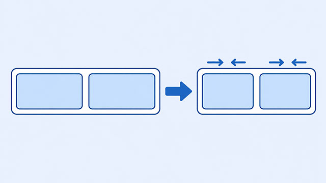
You set two boxes to a particular width, but they look narrower when placed side by side. In a flex layout, the browser can shrink boxes when the row has too little room. You can stop that shrinking, but you also need to decide where the extra width should go.
Picture two boxes sharing a shelf. If their widths and the space between them exceed the shelf’s width, something has to change. The browser’s usual choice in a simple flex row is to make the boxes narrower to fit.
The outside box holding the row is called the flex container. The boxes directly inside it are its flex items. If you have tried the CSS Flex lesson, these are the pieces you arranged with display: flex.
The Row Has Less Room Than the Boxes Need
Try this in the lesson’s sandbox. Put the following in the HTML panel. The outside div holds two matching boxes; their class names let the CSS select them.
<div class="row">
    <div class="item">One</div>
    <div class="item">Two</div>
</div>
The two inside boxes contain only short words, so their text will not get in the way of this experiment. Next, add this CSS to the CSS panel. The background colors make the boxes’ widths visible.
.row {
    display: flex;
    width: 300px;
    gap: 20px;
    background: #eaf1fe;
}

.item {
    width: 180px;
    background: #b8d0ff;
}
The boxes ask for 180 pixels each, and the gap needs 20 more: 380 pixels altogether. The row has only 300 pixels. It is 80 pixels short.
In this example, both boxes start at the same width and shrink equally. Each loses 40 pixels, leaving 140 pixels per box. Together with the 20-pixel gap, they fit the row exactly.
The width declaration still matters, but it does not prevent this later adjustment. The Flexbox specification describes this default behavior: items can start from their set size and shrink when room runs out.
Stop a Box From Shrinking
CSS has a setting for whether a flex item may become narrower: flex-shrink. Its default value is 1, which allows shrinking. A value of 0 means do not shrink.
Add this rule below the existing CSS. It selects the inside boxes, rather than the outside row. MDN’s flex-shrink reference documents the property and its default.
.item {
    flex-shrink: 0;
}
Now each box keeps its 180-pixel width. The second box extends beyond the row’s pale background because the total still needs 380 pixels. This is overflow: content reaches outside the space available for it.
Preventing shrinking does not create room. If you need everything to stay inside the row’s width, the layout needs another way to fit.
Let the Boxes Move to Another Row
If the boxes can sit on separate lines, keep the no-shrink rule and add the following below your CSS. This time the setting belongs on the outside row.
.row {
    flex-wrap: wrap;
}
The second box now moves below the first. Each remains 180 pixels wide in this example, and the row becomes taller. You have allowed another line instead of forcing both boxes into the same one.
This moves the boxes themselves. It is different from text breaking onto another line inside a box. The Flex lesson’s wrapping setting gives the layout somewhere to put items that do not fit together.
Check Which Result You Want
Choose the behavior that suits your content before changing more numbers:
- Keep both boxes on one row and allow them to become narrower: use the original example with its default shrinking.
- Keep their widths and allow another row: keep
flex-shrink: 0on the items andflex-wrap: wrapon the row. - Keep their widths on one row: remove the wrap rule and expect overflow whenever the row is too narrow.
For a quick check, change the original row width from 300px to 400px. The two 180-pixel boxes and their gap now fit on one line. Then restore 300px and compare the three choices, changing one rule at a time.
These results assume the simple row shown here. Long words and other sizing rules can change what happens on a larger page. Start with this small example so you can see what each change does before applying it to your own layout.
What to Learn Next
Use the lessons to practice arranging the row, setting sizes, and handling content that does not fit.
- CSS Flex explains how to arrange items and allow them to wrap onto another line.
- CSS Size explains the width and height settings used to size your boxes.
- CSS Overflow explains what happens when content extends beyond its box.