
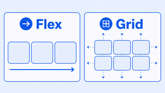
Flexbox and Grid are both CSS layout tools, but they are not the same tool. Use Flexbox when you mostly need to arrange items in one row or one column. Use Grid when rows and columns both matter.
That is the short beginner answer. It is not a rule you have to follow forever, but it is a useful way to stop guessing when you are building your first layouts.
By the end of this article, you should be able to look at a layout and make a practical choice: Flexbox for a line, Grid for a structure, and sometimes both together.
The Short Answer
Use Flexbox when the layout is mostly about arranging items across one direction.
- A row of navigation links.
- A group of buttons.
- A few items centered inside a box.
- A line of cards that can wrap when the screen gets smaller.
Use Grid when the layout is about rows and columns working together.
- A three-column card section.
- An image gallery.
- A page area with a sidebar and main content.
- A layout where items need to line up both across and down.
The confusing part is that both can make boxes sit next to each other. That overlap is real. The question is not, “Which one is better?” The better question is, “What kind of layout am I making?”
Think About the Direction of the Layout
A simple way to compare them is to think about direction.
Flexbox is usually easiest when your layout has one main direction. Maybe the items go left to right. Maybe they stack top to bottom. Either way, you are mainly thinking about one line of movement.
Grid is usually easiest when your layout has rows and columns. You are not only asking, “How do these items line up in a row?” You are also asking how they line up across the whole area.
MDN describes Flexbox as a one-dimensional layout method and Grid as a two-dimensional layout system. For beginners, that means Flexbox is about one direction at a time, while Grid is about rows and columns together.
That sounds technical, but you can picture it like this:
- Flexbox: beads on a string.
- Grid: boxes arranged on graph paper.
The beads can move closer together, farther apart, or wrap to another line. The graph paper gives you a clearer structure for rows and columns.
Use Flexbox for a Line of Items
Flexbox starts when you put display: flex on a parent element. The direct children inside that parent become flex items.
Here is a small example for a row of links:
.nav {
    display: flex;
    gap: 16px;
    align-items: center;
}
This CSS tells the browser to place the navigation items in a flexible row, add space between them, and line them up in the middle. The important part is that the layout is mostly about one row of items.
Flexbox is especially useful when the size of the items may vary. A link might have short text. A button might have longer text. Flexbox can still help them sit together in a way that feels easy to adjust.
The CSS Flexbox Summary goes deeper into flex containers, flex items, direction, gaps, wrapping, justify-content, and align-items.
Use Grid for Rows and Columns
Grid also starts on a parent element. This time, you use display: grid. The direct children inside that parent become grid items.
Here is a small example for a card layout:
.cards {
    display: grid;
    grid-template-columns: 1fr 1fr 1fr;
    gap: 20px;
}
This CSS creates three equal columns and puts space between the cards. The unit fr means a share of the available space, so each column gets one equal share.
Grid is useful when the layout itself has a shape. A gallery, a product list, a dashboard area, or a group of article cards usually benefits from clear columns and rows.
The CSS Grid Summary is the best next step if you want to practice columns, gaps, responsive grids, and the relationship between Grid and Flexbox.
You Can Use Both Together
One common beginner mistake is thinking you have to pick one tool for the whole website. You do not. Flexbox and Grid work together.
For example, you might use Grid to arrange a section of cards in three columns. Inside each card, you might use Flexbox to line up an icon and a title.
.cards {
    display: grid;
    grid-template-columns: 1fr 1fr 1fr;
    gap: 20px;
}

.card-title {
    display: flex;
    align-items: center;
    gap: 8px;
}
In that example, Grid handles the larger page structure. Flexbox handles the small alignment problem inside each card.
This is normal CSS. Grid does not replace Flexbox. Flexbox does not replace Grid. They are two layout tools that become more useful when you understand what each one is good at.
A Simple Checklist
When you are not sure which one to use, start with the layout problem in front of you.
- If you are arranging items in one row or column, try Flexbox first.
- If you need rows and columns, try Grid first.
- If you are aligning content inside a small component, Flexbox is often simpler.
- If you are building a repeated card section or gallery, Grid is often clearer.
- If the layout needs to change on mobile, think about how the boxes should stack or reflow.
This checklist is meant to help you start. As you build more pages, you will find cases where either tool can work. When that happens, choose the one that makes the CSS easier to understand.
The CSS Display Summary is also worth reviewing because display is the property that turns an element into a flex container or grid container in the first place.
What About Responsive Design?
Responsive design means your layout works on different screen sizes. Both Flexbox and Grid can help with that, but they help in different ways.
Flexbox can let items wrap when there is not enough room. Grid can change from one column on a small screen to several columns on a wider screen. Neither tool automatically makes a layout good, but both can make responsive layouts easier to build.
For a beginner project, a good approach is to build the small-screen layout first, then add more columns or wider spacing when the screen has room. That connects directly to the ideas in the Responsive Design Summary.
What to Learn Next
If this comparison makes sense, the next step is to practice each layout tool in the curriculum.
- CSS Grid Summary: Practice columns, gaps, card layouts, and responsive Grid patterns.
- CSS Flexbox Summary: Learn how flex containers, flex items, direction, gap, wrapping, and alignment work.
- CSS Display Summary: Review how the
displayproperty changes the way an element behaves on the page. - Responsive Design Summary: Connect layout choices to pages that work on both mobile and desktop screens.