
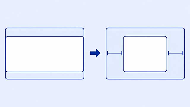
If you added margin: auto and your element did not move, the rule may be working but have no space to divide. For the usual horizontal-centering pattern, the element needs to be narrower than the area around it and behave like a block.
The first things to check are the element’s width and its display behavior. You’ll see why both matter, how to reveal the box you are moving, and what to change when margin: auto appears not to work.
This is mainly a technique for horizontal centering. It does not automatically place a box halfway between the top and bottom of a page.
What margin: auto Actually Does
Picture a smaller box sitting inside a wider box. There is some unused space to the left and right of the smaller box.
When the left and right margins are set to auto, the browser can divide that unused space equally. The result is equal side margins, so the smaller box appears centered.
The shorthand rule margin: 0 auto says two things: use 0 for the top and bottom margins, and use auto for the left and right margins. The CSS Margin lesson shows how these outside spaces fit around an element.
If the element already fills all the available width, there is no leftover room to split. The left and right auto margins can both be zero, so nothing looks different.
Fix 1: Give the Element Room to Move
Start with a parent box and a card inside it. The colors and border make the edges easy to see.
<div class="page">
    <div class="card">
        <h2>My Project</h2>
        <p>I am practicing CSS centering.</p>
    </div>
</div>
Here is CSS that may seem to fail:
.page {
    padding: 24px;
    background: #e8f1ff;
}

.card {
    margin: 0 auto;
    padding: 20px;
    border: 2px solid #315a8a;
    background: white;
}
A div normally behaves as a block, which means it uses the available width unless another rule limits it. The card is technically centered, but it is also as wide as the space it can use. There is no visible movement.
Now give the card a limit:
.card {
    max-width: 420px;
    margin: 0 auto;
    padding: 20px;
    border: 2px solid #315a8a;
    background: white;
}
The card can still become narrower on a small screen, but it will stop growing at 420px. On a wider screen, that creates space on both sides for the browser to divide.
You could use width instead, but max-width is often a friendly choice for a page card because it can shrink when needed. The lesson on CSS size properties explains the difference between width and max-width.
Fix 2: Check Whether the Element Is Inline
Some elements sit inside a line of text instead of making a full-width row. CSS calls this inline behavior. A span is a common example.
This code does not center the label as its own block box:
<span class="label">New Project</span>.label {
width: 180px;
margin: 0 auto;
padding: 8px;
background: #ffe7a8;
}The label still flows like part of a line. Its width and auto side margins do not create the same centering result as they do on a block.
Make it behave like a block, then keep the width limit:
.label {
    display: block;
    width: 180px;
    margin: 0 auto;
    padding: 8px;
    background: #ffe7a8;
}
Now the label gets its own row, has a visible width, and can receive equal left and right margins. The lesson on block and inline display behavior shows how the display property changes the way an element’s box participates in the page.
If you want to center inline text or an inline label without turning it into a block, a different pattern is to put text-align: center on its parent. That centers the inline content inside the parent; it is not the same job as using auto margins on the child.
Why It Does Not Vertically Center the Box
The word auto can sound as if the browser should divide space on all four sides. In an ordinary page layout, however, auto top and bottom margins do not create the same centering effect. The page keeps placing boxes one after another from the top.
That means margin: auto is not a general command for “put this in the exact middle.” For the pattern in this article, think left and right.
If you later need to center something both horizontally and vertically, Flexbox provides tools for that job. Learn the simpler auto-margin pattern first so you can recognize which direction each technique controls.
A Quick Checklist When Nothing Moves
When margin: auto is not giving you the result you expected, check the visible setup in this order:
- Confirm the selector. Temporarily add a bright background or border. If it does not appear, your CSS may be targeting a different element.
- Reveal the box. A border makes it clear whether the element already fills the available width.
- Limit the width. Try a reasonable
widthormax-widththat is smaller than the surrounding box. - Check the display. If the element is inline, try
display: blockfor this pattern. - Check the parent. The surrounding box must be wider than the element or there is no extra space to divide.
- Check the direction. Auto side margins handle horizontal centering here, not vertical centering.
This sequence keeps the problem concrete. You can see the selected box, see its width, and see whether there is room around it without opening the browser console.
Try the Working Pattern
Use the parent-and-card example from the first fix in your editor or code sandbox. Then make one change at a time:
- Start with
max-width: 420pxandmargin: 0 autoon the card. - Remove
max-widthand notice how the card fills the row. - Restore
max-width, then adddisplay: inlineand notice how the box changes. - Change it back to
display: blockand confirm that the card centers again.
The important idea is not to memorize a magic line of CSS. It is to look for leftover horizontal space and a box that can use auto side margins. Once you can see those two conditions, the result becomes easier to predict.
What to Learn Next
Now that the centering pattern is visible, these lessons explain the three parts behind it.
- CSS Margin explains the outside space around a box and how the margin shorthand works.
- CSS Size shows how
widthandmax-widthcontrol the room a box uses. - CSS Display explains why block and inline elements behave differently in a page layout.