
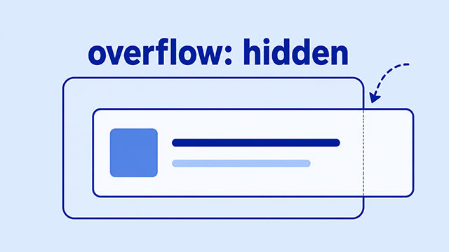
If overflow: hidden is not working, CSS may not be ignoring you. The rule may be on the wrong box, the box may not have a real size limit, or the problem may be wrapping, padding, or positioning instead of overflow.
The short version is this: overflow: hidden only hides content that goes outside the box it is applied to. It does not make the box smaller. It does not stop every layout problem. It does not automatically know which part of the page you meant to control.
To fix it, start by finding the box that should clip the content. Then check whether that box has a real limit, such as a width, height, max-width, or max-height.
The Short Answer
overflow: hidden tells the browser to hide the part of an element’s contents that sticks outside that element’s box.
The important phrase is that element’s box. If you put the rule on the wrong element, it may hide nothing useful.
The other important idea is outside the box. If the box grows to fit everything inside it, then nothing is actually overflowing. There is nothing for overflow: hidden to hide.
That is why overflow problems are usually really box problems. The CSS Overflow lesson is the main lesson for this idea, but you will also use size, box model, display, and position concepts while debugging it.
Check the Box That Has Overflow Hidden
A common beginner mistake is putting overflow: hidden on the thing that is too large, instead of putting it on the box that should contain it.
In this example, the image is wider than the card. The rule is on the image itself, so it does not make the card clip the image.
<div class="card">
    <img class="photo" src="student-project.jpg" alt="Student project" />
</div>
.card {
width: 300px;
border: 2px solid #333;
}
.photo {
width: 420px;
overflow: hidden;
}The card is the box that should do the clipping, so the rule belongs on the parent box.
.card {
    width: 300px;
    border: 2px solid #333;
    overflow: hidden;
}

.photo {
    width: 420px;
}
Now the image can still be wider than the card, but the card hides the part that sticks out. The rule works because it is on the containing element, not the oversized child.
Give the Container a Real Limit
Another common issue is that the box has no real limit. If a box can keep growing, the browser may simply make it taller or wider to fit the content.
Here, the note has overflow: hidden, but no height limit. The box can grow, so the text is not forced outside of it.
.note {
    width: 280px;
    overflow: hidden;
    border: 1px solid #999;
}
If you want the box to clip extra text, the box needs a constrained size.
.note {
    width: 280px;
    max-height: 120px;
    overflow: hidden;
    border: 1px solid #999;
}
Now the note can only grow to 120 pixels tall. If the content needs more room than that, the extra part is hidden.
This is why the CSS Size lesson matters here. Width, height, max-width, and max-height define the space the browser is trying to work within.
Watch for Padding, Width, and Horizontal Scroll
Sometimes overflow: hidden seems broken because the element is wider than you think.
This can happen when a box uses width: 100% and also has padding. With the default box model, the width controls the content area, and padding can be added on top of that width.
.banner {
    width: 100%;
    padding: 24px;
    overflow: hidden;
}
The visible banner may become wider than expected. If that creates a horizontal scrollbar, hiding overflow on the banner may not fix the real cause.
A common beginner-friendly fix is to use box-sizing: border-box, so the padding is included inside the declared width.
* {
    box-sizing: border-box;
}
This does not solve every overflow problem, but it makes widths easier to predict. The CSS Box Model lesson explains why content, padding, border, and margin all affect the space a box uses.
Check Display, Wrapping, and Inline Elements
Not every visible problem is an overflow problem. Sometimes the browser is wrapping content onto a new line instead of letting it overflow.
For example, inline and inline-block elements can behave differently from normal block boxes. Text can wrap. Buttons can move to the next line. A row of items can break because there is not enough room.
In that situation, overflow: hidden may be working, but the layout never creates the overflow you expected. The content is wrapping before clipping.
That is a sign to check the element’s display behavior. The CSS Display lesson explains the difference between block, inline, inline-block, flex, grid, and none.
Check Positioned Children
Positioning can also make overflow harder to understand.
An element with position: absolute is taken out of the normal page layout. It can be placed with top, right, bottom, and left values. That can make the child appear outside the area where you expected it to stay.
If an absolutely positioned child is involved, check whether the parent has position: relative. That often gives the child a clear positioning parent.
.card {
    position: relative;
    width: 300px;
    height: 180px;
    overflow: hidden;
}

.badge {
    position: absolute;
    right: -20px;
    top: 20px;
}
In this example, the badge is intentionally pushed partly outside the card. The card clips it because the card has both a size limit and overflow: hidden.
If positioning is new to you, the CSS Position lesson is worth reviewing before you spend too long guessing.
A Simple Debugging Checklist
When overflow: hidden does not do what you expected, slow down and check one thing at a time.
- Is
overflow: hiddenon the container that should hide the extra content? - Does that container have a real width, height, max-width, or max-height?
- Is the child actually larger than the container?
- Is padding or border making the box wider than expected?
- Is the content wrapping instead of overflowing?
- Is a positioned child being placed outside the normal layout?
You can also temporarily add an outline while debugging:
* {
    outline: 1px solid red;
}
This is not something to leave on a finished website. It is just a quick way to see the boxes while you figure out which one is causing the problem.
What to Learn Next
If overflow: hidden is starting to make sense, the next step is learning the box and layout ideas around it.
- CSS Overflow explains the core idea of content that does not fit inside a box.
- CSS Size shows how width, height, max-width, and max-height affect the space an element has.
- The CSS Box Model explains how content, padding, border, and margin change the final size of a box.
- CSS Display helps you understand whether an element acts like a block, inline item, flex container, or grid container.
- CSS Position explains how relative, absolute, and fixed positioning can move elements outside the normal page layout.