
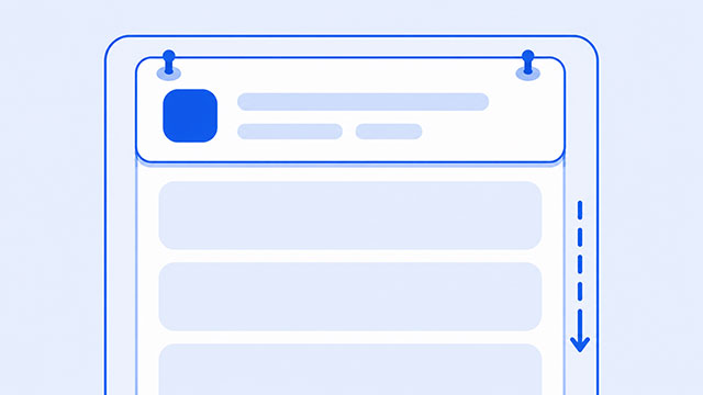
If position: sticky is not working, the problem is usually not the word sticky. It is usually missing a top value, trapped inside the wrong parent, inside a container that is too short, or stretched by the layout around it.
That can feel strange at first because sticky sounds like it should be simple. You add one CSS property, scroll the page, and expect the element to stay visible.
But sticky positioning is not the same as fixed positioning. A sticky element starts in the normal page layout. Then it sticks only after scrolling reaches a certain point. It also stops sticking when the area that contains it runs out.
Once you understand that, the fixes become much easier to check.
The Simple Rule Behind Position Sticky
A sticky element has two jobs.
- It behaves like a normal element at first.
- It sticks when the page, or its scroll container, reaches the offset you gave it.
The important phrase is the offset. If you want something to stick to the top, the browser needs to know where the top stopping point is.
That is why a sticky navigation often looks like this:
.nav {
    position: sticky;
    top: 0;
}
The element is still part of the normal page. It does not float over everything from the start. When scrolling reaches the point where the element would be 0 pixels from the top, it starts to stick.
If you want the bigger picture behind this behavior, the CSS position lesson explains how normal flow, relative, absolute, fixed, and positioned elements fit together.
Check That You Set a Top, Bottom, Left, or Right Value
The first thing to check is simple: did you give the sticky element a place to stick?
For vertical sticky behavior, use top or bottom. For horizontal sticky behavior, use left or right.
This usually works for a top navigation bar:
.site-header {
    position: sticky;
    top: 0;
}
This may not stick the way you expect:
.site-header {
    position: sticky;
}
Without an inset value such as top: 0;, the browser does not have a sticky threshold on that axis. The element may act much more like relative positioning.
Check the Parent and Scroll Container
The next common problem is the parent container.
A sticky element does not always stick relative to the whole browser window. It can stick relative to its nearest scrolling ancestor. In plain language, that means a parent or wrapper can become the area that controls the sticky behavior.
Watch for parent elements with overflow rules like these:
.page-wrapper {
    overflow: hidden;
}
.sidebar-wrapper {
overflow: auto;
}These rules are not always wrong. Sometimes they are exactly what a layout needs. But they can make sticky behavior look broken because the browser is using that wrapper as the sticky area.
A quick test is to temporarily remove the overflow rule from the parent wrapper and refresh the page. If sticky starts working, you have found the part of the layout that is changing the scroll area.
Do not delete layout code blindly. Use the test to understand the cause, then decide whether the overflow rule belongs on a different element.
Make Sure the Parent Is Tall Enough
A sticky element can only stick inside the area that contains it.
Think of the parent as a track. The sticky element can move along that track, but when the track ends, the sticky behavior ends too.
That is why sticky sometimes works for a split second and then scrolls away. The parent may be too short to give the sticky element room to stay stuck.
Here is a small example:
<section class="short-section">
    <aside class="sticky-note">Helpful note</aside>
</section>
.short-section {
height: 120px;
}
.sticky-note {
position: sticky;
top: 0;
}The sticky note does have a top value. But the section is so short that there is barely any room for the sticky behavior to happen.
For testing, add more content below the sticky element or give the parent more height. If sticky suddenly makes sense, the issue was not enough room.
Watch for Flex and Grid Stretching
Sticky can also be confusing inside flex or grid layouts.
The sticky rule may technically be working, but the element may be stretched in a way that leaves no visible movement. This is common when a sidebar or navigation area sits inside a row layout.
If the parent uses display: flex;, remember that the parent becomes a flex container and the direct children become flex items. The flex containers and flex items lesson explains that relationship in more detail.
For sticky debugging, try giving the sticky item its natural height instead of letting it stretch. Depending on the layout, a rule like this may help you test the idea:
.sidebar {
    position: sticky;
    top: 1rem;
    align-self: start;
}
The important part is not memorizing that exact rule. The important part is checking whether the layout around the sticky element is stretching it or removing the space it needs to move.
A Beginner Debugging Checklist
When sticky is not working, check the simple things first.
- Confirm the element has
position: sticky;. - Confirm it has a sticky offset, usually
top: 0;ortop: 1rem;. - Look at each parent wrapper and check for
overflow: hidden;,overflow: auto;, oroverflow: scroll;. - Make sure the parent is tall enough for the sticky element to move.
- If the element is inside flex or grid, check whether it is being stretched.
- Move the sticky element into a very simple test page and compare the behavior.
That last step is useful because it separates sticky itself from the rest of your layout. If the same sticky rule works in a simple page, the problem is probably one of the wrappers around it in the original page.
The display property also matters here because display changes how elements behave in the layout. A block element, flex container, grid container, and hidden element do not create the same layout conditions.
Sticky vs Fixed
Beginners often switch from sticky to fixed when sticky does not work.
That can solve a different problem, but it does not mean fixed and sticky are the same.
position: sticky;starts in normal flow, then sticks within a boundary.position: fixed;attaches to the viewport and stays there while the page scrolls.
Fixed positioning is useful for things like small buttons, persistent headers, or floating controls. But because fixed elements are removed from normal page flow, they can cover other content if you do not leave space for them.
Sticky is often better when you want the element to begin where it naturally belongs, then stay visible only while its section is still relevant.
What to Learn Next
If sticky is starting to make sense, the next step is learning the layout ideas around it.
- CSS Position Summary explains normal flow, relative, absolute, fixed, and positioned elements.
- CSS Display Summary shows how elements behave as block, inline, flex, grid, or hidden elements.
- CSS Flexbox Summary helps with sticky sidebars, navigation rows, and stretched flex items.
- CSS Breakpoints Summary helps you test sticky headers and sidebars across different screen sizes.