
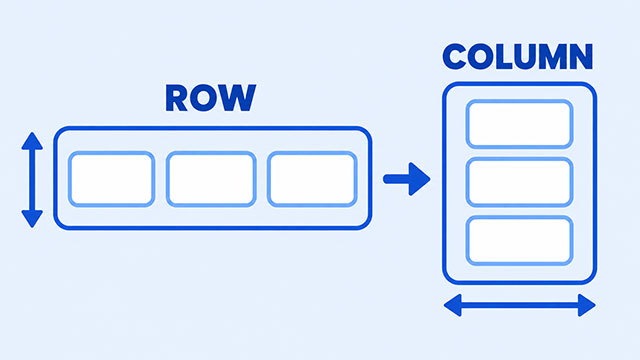
If align-items seems to move your boxes sideways instead of up and down, the property probably is working. Changing flex-direction changes the direction Flexbox uses as its reference, so the cross direction changes too.
The useful idea is that Flexbox has two directions. One direction is where the items travel. The other direction crosses that path. justify-content works along the first direction, while align-items works across it.
Once you look at the parent container first, the behavior becomes much easier to predict. This article uses a row and a column to show why the same CSS property can affect different sides of the page.
The Short Answer: Flexbox Has Two Directions
When you add display: flex to an element, that element becomes the flex container. Its direct children become flex items. The items then line up in one main direction.
By default, the main direction is a row from left to right. The other direction runs across that row, from top to bottom. Flexbox gives these two directions names: the main axis and the cross axis.
You do not need to memorize the names first. Picture a line of boxes. Along the line is the main direction. Across the line is the cross direction.
What Changes Between a Row and a Column
Here is a small group of boxes. The HTML stays the same while the CSS changes the direction of the group.
<div class="menu">
    <div>Home</div>
    <div>About</div>
    <div>Contact</div>
</div>
.menu {
display: flex;
flex-direction: row;
justify-content: center;
align-items: center;
min-height: 160px;
}
.menu {
/* Change row to column to stack the items. */
flex-direction: column;
}With row, the items travel horizontally. That makes the cross direction vertical, so align-items: center centers the items from top to bottom. With column, the items travel vertically. The cross direction is now horizontal, so align-items: center centers them from left to right.
That is why align-items is not really a “vertical alignment” property. It is a cross-axis property. The cross axis depends on the direction of the flex container.
align-items and justify-content Side by Side
The two properties are easiest to understand as a pair:
- justify-content distributes extra space along the direction the items travel.
- align-items positions the items across that direction.
- flex-direction decides whether the items travel in a row or a column.
In a row, justify-content usually affects left and right spacing, while align-items usually affects top and bottom alignment. In a column, those screen directions switch roles: justify-content affects top and bottom spacing, and align-items affects left and right alignment.
So when you want to center a group in both directions, you often use both properties:
.menu {
    display: flex;
    justify-content: center;
    align-items: center;
    min-height: 160px;
}
The important part is not the word center. It is knowing which axis each property controls in the current direction.
Why align-items Sometimes Appears to Do Nothing
An item can only move when there is open space to move into. If the flex container is exactly as tall as its content, there may be no visible top-to-bottom movement for align-items to show.
In a row, give the container some extra height if you want to see cross-axis alignment:
.menu {
    display: flex;
    align-items: flex-end;
    min-height: 160px;
}
Now the items have room to sit at the bottom of the container. If you change flex-direction to column, the cross direction becomes horizontal, so align-items: flex-end moves the items toward the cross-axis end instead.
A Quick Check for Your Own Layout
When an alignment rule surprises you, check the parent before changing random values.
- Find the element with
display: flex. That is the container whose direction matters. - Check
flex-direction. Is the group traveling in a row or a column? - Remember that
justify-contentfollows the travel direction andalign-itemscrosses it. - Make sure the container has extra space in the direction you want to see change.
For a quick exercise, predict what will happen before you edit the CSS. Start with a row, set both properties to center, and then change the direction to a column. Watch which screen direction each property controls after the change.
The CSS Flex lesson gives you a place to practice this with other Flexbox behaviors. If the phrase display: flex is still unfamiliar, the CSS Display lesson explains how an element becomes a layout container.
What to Learn Next
Now practice the idea in the curriculum:
- CSS Flex Summary — practice direction, spacing, alignment, and wrapping in one-direction layouts.
- CSS Display Summary — understand how
display: flexchanges the way a parent lays out its children.