
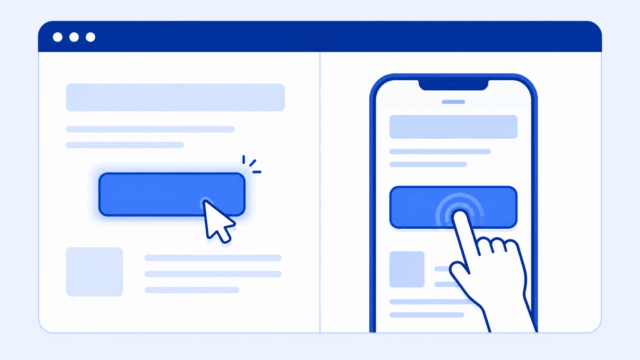
If your CSS hover effect works on your computer but feels strange or broken on your phone, you probably didn’t do anything wrong.
Hover is built around a mouse or trackpad. The pointer moves over something, stays there for a moment, and the browser can apply a hover style.
A phone does not work that way. A finger taps the screen. There is no mouse pointer sitting over the button, card, image, or link. That means hover is not a dependable interaction on touch screens.
The most useful rule is simple. Hover can add polish, but important information and controls should work without hover.
What Hover Means on Desktop
On a desktop or laptop, hover means the user has moved the mouse pointer over an element.
You might use hover to make a button change color when someone points at it.
.button:hover {
    background: black;
    color: white;
}
The :hover part is called a pseudo-class. A pseudo-class is a CSS keyword that lets you style an element in a certain state.
In this example, the browser does something like this:
- The mouse moves over the button.
- CSS applies the hover style.
- The mouse leaves the button.
- CSS removes the hover style.
That is a natural desktop interaction. It gives the user a small visual signal that the element can be clicked.
If you want the basic lesson first, review the CSS hover lesson and the broader CSS events lesson.
Why Phones Are Different
A phone does not have a mouse pointer. The user touches the screen with a finger.
That changes the interaction completely. A finger can tap, press, swipe, drag, or scroll. But it cannot calmly rest over a button the same way a mouse pointer can.
Some mobile browsers try to simulate hover. That can make things feel inconsistent.
- Sometimes the hover style appears for a moment.
- Sometimes the hover style seems to stay stuck.
- Sometimes the first tap triggers the hover state.
- Sometimes the tap goes straight to the link or button action.
That is why hover can seem broken on mobile. It is not really broken. It is just the wrong tool for the main job.
Don’t Hide Important Information Behind Hover
The biggest beginner mistake is using hover to reveal something the user actually needs.
For example, imagine a card that only shows its description when someone hovers over it.
.card-details {
    display: none;
}

.card:hover .card-details {
    display: block;
}
This might seem fine on a laptop. You move your mouse over the card, and the details appear.
But on a phone, the user may not have any clear way to reveal those details. They might tap the card and nothing obvious happens. Or the details might flash and disappear. Or the card might open a link before the user can read anything.
That is a user experience problem, not just a CSS problem.
- Don’t hide navigation options only on hover.
- Don’t hide important button labels.
- Don’t require hover to reveal instructions.
- Don’t make cards unusable without hover.
If the user needs the information to understand or use the page, show it without hover.
Use Hover as a Desktop Enhancement
Hover is still useful. You do not need to avoid it completely.
A hover effect can make a link, button, card, or menu feel more interactive on desktop. It can give the user a little feedback that says, “Yes, this thing responds.”
That is a good use of hover.
.button {
    background: white;
    color: black;
    border: 1px solid black;
}

.button:hover {
    background: black;
    color: white;
}
The button still works without the hover effect. The text is visible. The button can still be tapped. The hover state just adds a little extra feedback for people using a mouse.
That is the right mental model. Hover should make a working design feel better. It should not be the only way the design works.
Better Mobile Alternatives
When hover is not dependable, choose an interaction that works on touch screens.
The simplest option is usually the best one. Show the content by default.
<div class="card">
    <h2>Project Title</h2>
    <p class="card-details">This project uses HTML and CSS.</p>
</div>
In this version, the details are just visible. There is nothing to unlock. There is nothing to discover by accident. The page is easier to understand.
Other useful options include:
- Use a real button when the user needs to open or close something.
- Use
:focusso keyboard users can see where they are on the page. - Use
:activefor a brief pressed state when someone clicks or taps. - Use a responsive layout instead of a hover-only reveal.
- Use JavaScript for tap behavior only when the interaction really needs it.
You do not need to solve every mobile interaction with JavaScript. A lot of the time, the better solution is to make the important content visible and clear from the start.
Use Focus and Active When They Help
CSS has other interaction states besides hover.
:focus applies when an element is selected by the keyboard or another input method. This is especially important for people who do not use a mouse.
:active applies while an element is being clicked or pressed.
.button:hover,
.button:focus {
    outline: 2px solid black;
}

.button:active {
    transform: scale(0.98);
}
This gives different kinds of users useful feedback. A mouse user can see hover. A keyboard user can see focus. A person tapping or clicking can get a short active state.
If you are just starting, do not worry about memorizing every pseudo-class. The main idea is that different devices and different users interact with pages in different ways.
Use Media Queries Carefully
A media query lets you write CSS that only applies under certain conditions, like when the screen is wider than a certain size.
For hover problems, a good beginner approach is to start with the mobile version first. Make the important content visible. Then add hover as an extra effect on larger screens.
.card-details {
    display: block;
}

.card {
    border: 1px solid #ccc;
    padding: 20px;
}

@media (min-width: 700px) {
    .card:hover {
        border-color: black;
    }
}
In this example, the details are visible on every screen. The hover effect only changes the card border on wider screens. Nothing important depends on hover.
This connects directly to CSS breakpoints. Breakpoints let you adjust a design for different screen sizes, but they should not be used to hide important content from mobile users.
A More Advanced Hover Check
There is also a media query that can check whether the device supports hover.
@media (hover: hover) {
    .button:hover {
        background: black;
        color: white;
    }
}
This tells the browser to use the hover style only when hover is actually available.
You do not need this on every beginner project. But it is useful to know that CSS can check for more than just screen width. It can also respond to how the device is used.
A Simple Beginner Rule
When you are deciding whether to use hover, ask one question:
Would the page still make sense if hover did not work?
If the answer is yes, the hover effect is probably fine.
If the answer is no, redesign that part of the page.
- If the user needs the information, show it.
- If hover only adds polish, it is fine.
- If hover is required to use the page, it is probably the wrong interaction.
This is one of those places where CSS and user experience overlap. The code matters, but the user’s situation matters just as much.
Try This Yourself
To understand the difference, make a simple button and test it on both desktop and mobile.
<a class="button" href="#">Learn More</a>.button {
display: inline-block;
padding: 12px 20px;
border: 1px solid black;
}
.button:hover {
background: black;
color: white;
}On desktop, move your mouse over the button. On a phone, tap it. Notice how different those two interactions feel.
Then ask yourself whether the button is still understandable without the hover style. If it is, you are using hover in a safe way.
What to Learn Next
If hover is starting to make more sense, the next step is learning how interaction, layout, and responsive design fit together.
- CSS events explain states like hover, active, focus, visited, and checked.
- CSS hover explains the hover state directly.
- Hover trigger shows how one element can affect another when it is hovered.
- CSS breakpoints help you adapt designs for different screen sizes.
- Responsive design explains why pages need to work across phones, tablets, and desktops.
- User experience helps you think about what the person using the page actually needs.
For now, keep the main rule in mind. Hover is an extra. Your page should still work when hover is not available.