
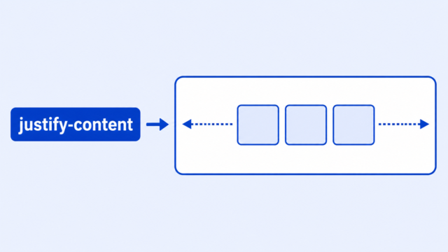
If justify-content is not working in CSS Flexbox, it usually means the element is not a flex container, you are styling the wrong parent, the direction is different than you expect, or there is no extra space for the items to move into.
That can feel strange at first because the CSS looks correct. You type justify-content: center;, refresh the page, and nothing seems to change. The browser is usually not ignoring you. It is following Flexbox rules that are easy to miss when you are new.
The useful question is not just “Why is this broken?” The better question is, which box is Flexbox controlling? Once you can answer that, most alignment problems become much easier to debug.
The Quick Answer
justify-content works on a flex container. That means it belongs on the parent element with display: flex;. It moves that parent’s direct children along the main direction.
Here is a small working example:
<nav class="menu">
    <a href="#">Home</a>
    <a href="#">Projects</a>
    <a href="#">Contact</a>
</nav>
.menu {
display: flex;
justify-content: center;
gap: 20px;
border: 1px solid red;
}The nav is the flex container. The links are the flex items. Because the parent has display: flex;, justify-content: center; can center the links across the row.
The red border is only there to help you see the container. When you are debugging layout, a temporary border can show you where the space actually is.
Check That the Parent Has Display Flex
The most common beginner mistake is using justify-content without turning the element into a flex container first.
This CSS looks like it should center the links, but it is missing the important line:
.menu {
    justify-content: center;
    gap: 20px;
}
The fix is to add display: flex; to the same selector:
.menu {
    display: flex;
    justify-content: center;
    gap: 20px;
}
The display property controls how an element behaves in layout. With display: flex;, the element becomes a flex container and its direct children become flex items.
Without that change, justify-content may have nothing useful to control in the layout you are trying to build.
Make Sure You Are Styling the Flex Container
Flexbox works through a parent-child relationship. The parent becomes the flex container. Its direct children become the flex items.
That means justify-content does not reach down through every nested element on the page. It only affects the items that are directly inside the flex container.
Here is a common version of the problem:
<div class="card">
    <div class="card-content">
        <button>Start</button>
    </div>
</div>
.card {
display: flex;
justify-content: center;
}This centers .card-content, not necessarily the button. The button is one level deeper, so the flex rule is not directly moving it.
If you want to center the button inside .card-content, make .card-content the flex container:
.card-content {
    display: flex;
    justify-content: center;
}
When your layout is not moving, ask which element is the direct parent of the thing you want to move. That is usually where your Flexbox rule belongs.
Check the Direction of the Main Axis
justify-content moves flex items along the main axis. The main axis is the direction your flex items are flowing.
By default, Flexbox uses a row. In a row, justify-content moves items left and right.
.menu {
    display: flex;
    flex-direction: row;
    justify-content: center;
}
If you change the direction to column, the main axis changes too. Now justify-content moves items up and down.
.menu {
    display: flex;
    flex-direction: column;
    justify-content: center;
}
This is why a rule can look like it stopped working when you change flex-direction. It may still be working, but it is working in a different direction.
For many beginner layouts, remember this simple pairing:
justify-contentcontrols the main direction.align-itemscontrols the other direction.
The CSS Flex lesson goes through this idea as part of the larger Flexbox model.
Check Whether There Is Extra Space
justify-content distributes available space. If there is no available space, there may be nothing visible for it to do.
Imagine a row where the items already take up the full width of the container:
.menu {
    display: flex;
    justify-content: space-between;
}

.menu a {
    width: 33.333%;
}
Those three links already fill the row. There is no leftover room to put between them, so space-between may not create the spacing you expected.
This is also why temporary visual debugging helps. Add a border to the container and a background to the items:
.menu {
    display: flex;
    justify-content: center;
    border: 1px solid red;
}

.menu a {
    background: #eeeeee;
}
Now you can see whether the parent is wider than the children. If the parent has extra horizontal space, centering or spacing should become visible.
Do Not Confuse Justify-Content, Align-Items, and Align-Content
These property names are close enough that beginners mix them up all the time. The difference is what each property controls.
justify-contentmoves items along the main axis.align-itemsmoves items along the cross axis, which is the other direction.align-contentcontrols the spacing between multiple flex lines when items wrap.
For a normal one-line Flexbox layout, you will usually use justify-content and align-items first. Save align-content for cases where your flex items wrap onto more than one line and the container has extra space in the cross direction.
Another common mistake is trying a value on the wrong property. For example, align-items: space-between; is not the same as justify-content: space-between;. The property and value need to belong together.
A Beginner Troubleshooting Checklist
When justify-content does not seem to work, check these in order. This keeps you from changing random CSS and losing track of the real problem.
- Find the element that directly contains the items you want to move.
- Add
display: flex;to that parent element. - Put
justify-contenton the same parent element. - Check whether the items are direct children of that parent.
- Check
flex-directionso you know which way the main axis runs. - Add a temporary border to the parent so you can see its real size.
- Check whether the items already fill all the available space.
- If the layout changes on small screens, check your responsive breakpoints.
The main habit is to debug one relationship at a time: parent, direct children, direction, available space.
When Flexbox May Not Be the Right Tool
Flexbox is usually best when you are arranging items in one main direction: a row of navigation links, a line of buttons, a card header, or a group of small boxes.
If you are trying to control rows and columns at the same time, Flexbox can still help, but CSS Grid may be easier to understand. Grid is built for two-dimensional layouts, where both rows and columns matter.
That does not mean you chose wrong if you started with Flexbox. It just means layout tools have different strengths. A simple row is often Flexbox. A larger page structure is often Grid.
What to Learn Next
If justify-content is starting to make sense, the next step is to connect this debugging idea to the rest of CSS layout.
- CSS Flex explains flex containers, flex items, direction, gap, alignment, and wrapping.
- CSS Display explains how
display: flex;changes the way an element behaves on the page. - CSS Grid helps when you want rows and columns to work together in a larger layout.
- CSS Break Points helps when your Flexbox layout works at one screen size but breaks at another.